Epicurious Information Architecture Redesign
While the content on Epicurious is extensive, the site’s information architecture lacks consistency and structure, making it hard for users to browse efficiently. Our goal was to redesign the site’s navigation to improve content discoverability and support clearer user pathways, especially when navigating recipe types.
Overview
Role
Our small team of three (me, Ally Swick and Samra Khan) divided the content inventory work. I created the wireframes for the task flows. All three team members worked together to set up the various research instruments, analyze results, and report findings in a formal research report.
Research Methods
Content Inventory
Card Sorting (2 rounds)
Tree Testing (2 rounds)
First-Click Testing
Research Tasks
Content Inventory
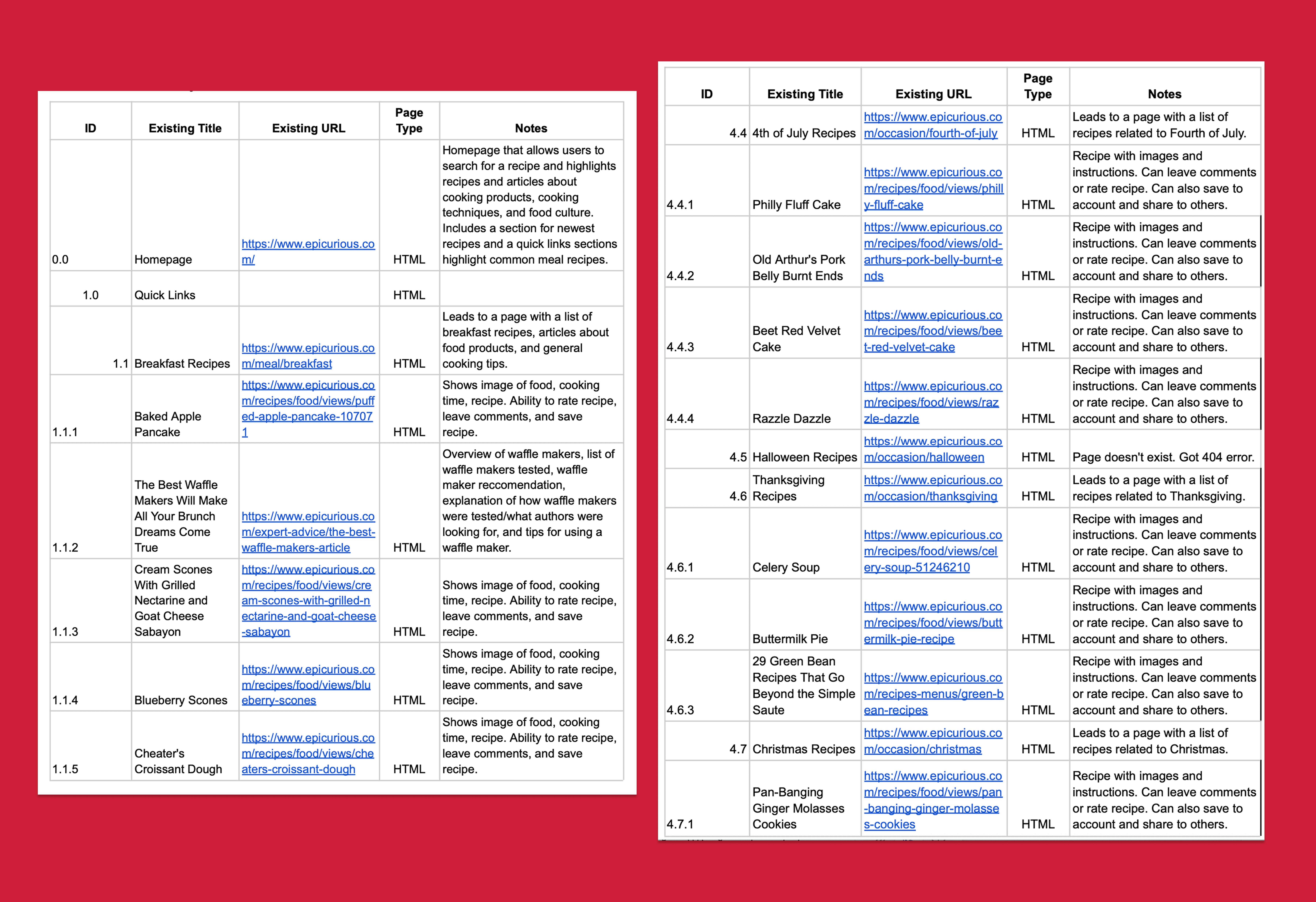
An excerpt of our content inventory of Epicurious
The content inventory revealed that Epicurious had rich content but minimal organization. The lack of a clear structure, combined with inconsistent labeling and missing mobile support, made it hard for users to browse intentionally. Categories such as Expert Advice, Videos, and Ingredients overlapped in the kind of content they contained. Epicurious had no consistent 2nd-level navigation, especially on mobile.
Research Tasks
Card Sort
To create the site’s organizational structure, our team conducted three card sorts of our main navigation menu and structure. The card sorts included a small pilot of 3 participants, and two formal data collection rounds with 12 participants each.
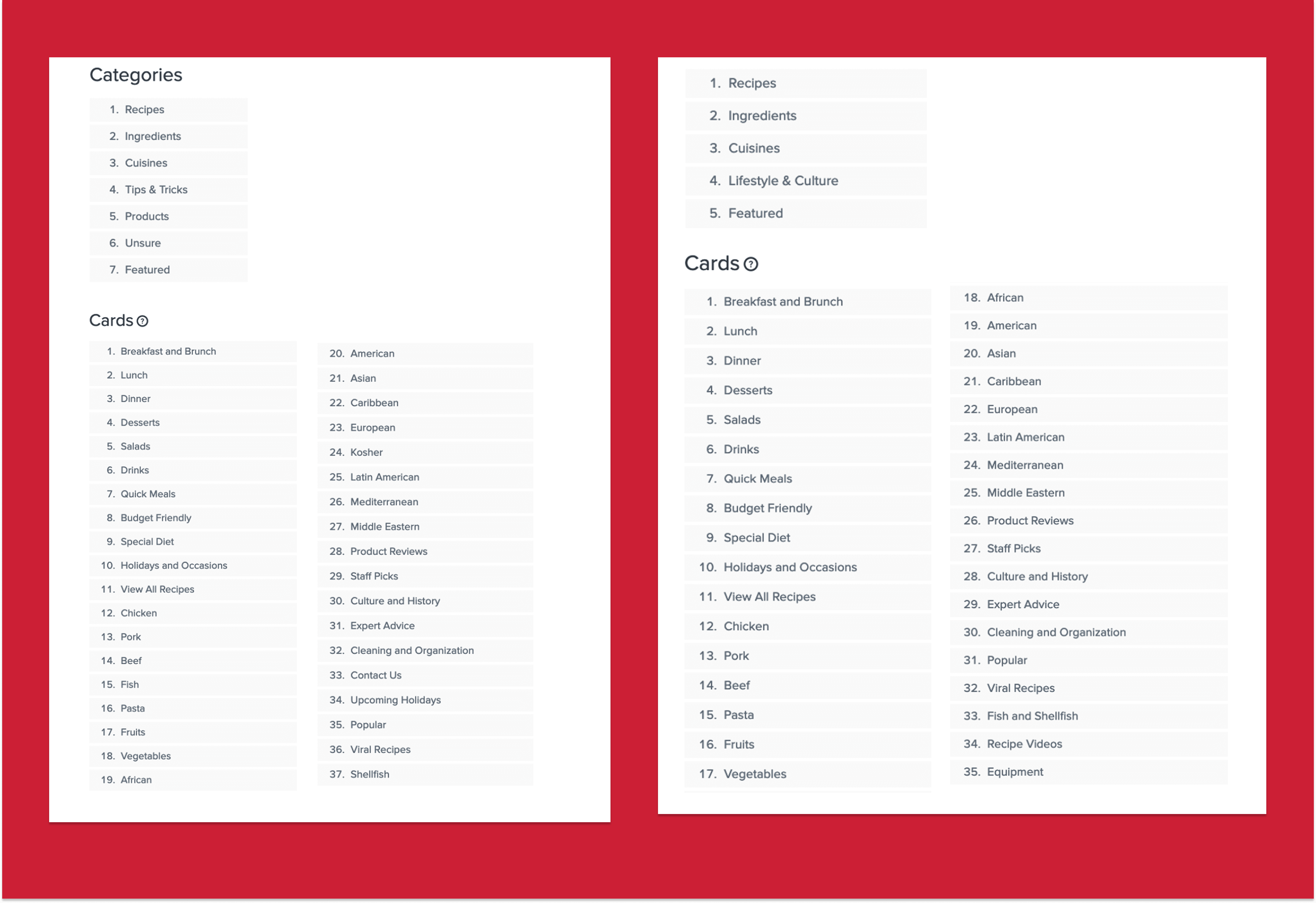
The cards and categories for card sort 1 and 2 (the pilot is not pictured).
Results
Multiple card labels were difficult to place; for example, participants placed "Viral Recipes" in categories of Featured (42%) and Recipes (50%).
Smaller categories like "Product" and "Tips & Tricks" were rarely selected as parent categories. Participants placed items like Product Reviews (75%) under "Featured."
Lifestyle articles on topics like the history of ketchup didn't fit into any existing category structure.
IMPACT ON DESIGN
We added a broad "Lifestyle & Culture" category to replace thinner “Product” and “Tips & Tricks” categories.
We removed “Featured” as a primary nav category, but kept featured-style articles in the homepage.
We renamed “Recipe Videos” to “Video Tutorials & More” to reflect the broad video content on the site.
Research Tasks
Tree Testing
We conducted two rounds of remote tree testing to assess whether users could find specific pieces of content using only the site’s navigation labels. Participants were given brief but key tasks like “Find a kosher recipe” or “Look for pantry organization tips,” and asked to navigate through a simplified version of the site structure. We tracked success rates, where users clicked first, and whether they reached the correct destination.
Both of the two rounds included six separate participants, for a total of twelve across both tests.
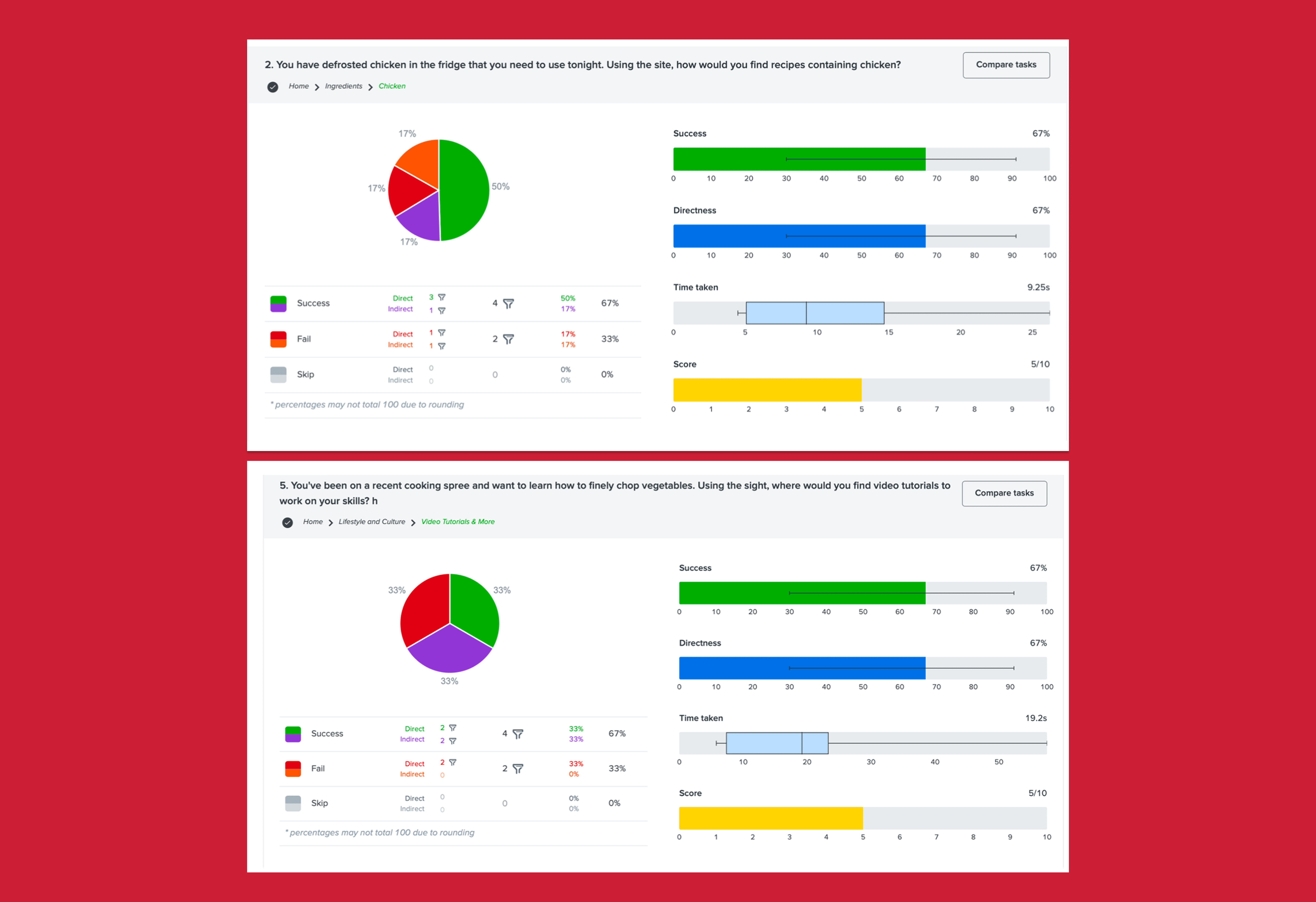
Two example results screens for two treejack tasks
Results
Finding kosher recipes was difficult with 0% success in Round 1 and only 50% in Round 2. Users were split between Cuisines, Recipes, and Holidays.
Finding chicken recipes dropped from 100% success in Round 1 to 67% in Round 2, suggesting that some users saw "chicken" as a meal type rather than an ingredient.
A new task added in Round 2 — finding video tutorials — also saw only 67% success, indicating that the label “Video Tutorials & More” still wasn’t clear to all users.
IMpact on Design
We duplicated the label of “Kosher” under both Cuisines and Recipes.
We moved “Holidays & Occasions” to Lifestyle & Culture to avoid overlap with Recipes.
We kept Ingredients as a top-level category, but flagged it for future testing due to some user confusion.
Overall, the testing validated core navigation choices while highlighting a few labels that still needed refinement.
Research Tasks
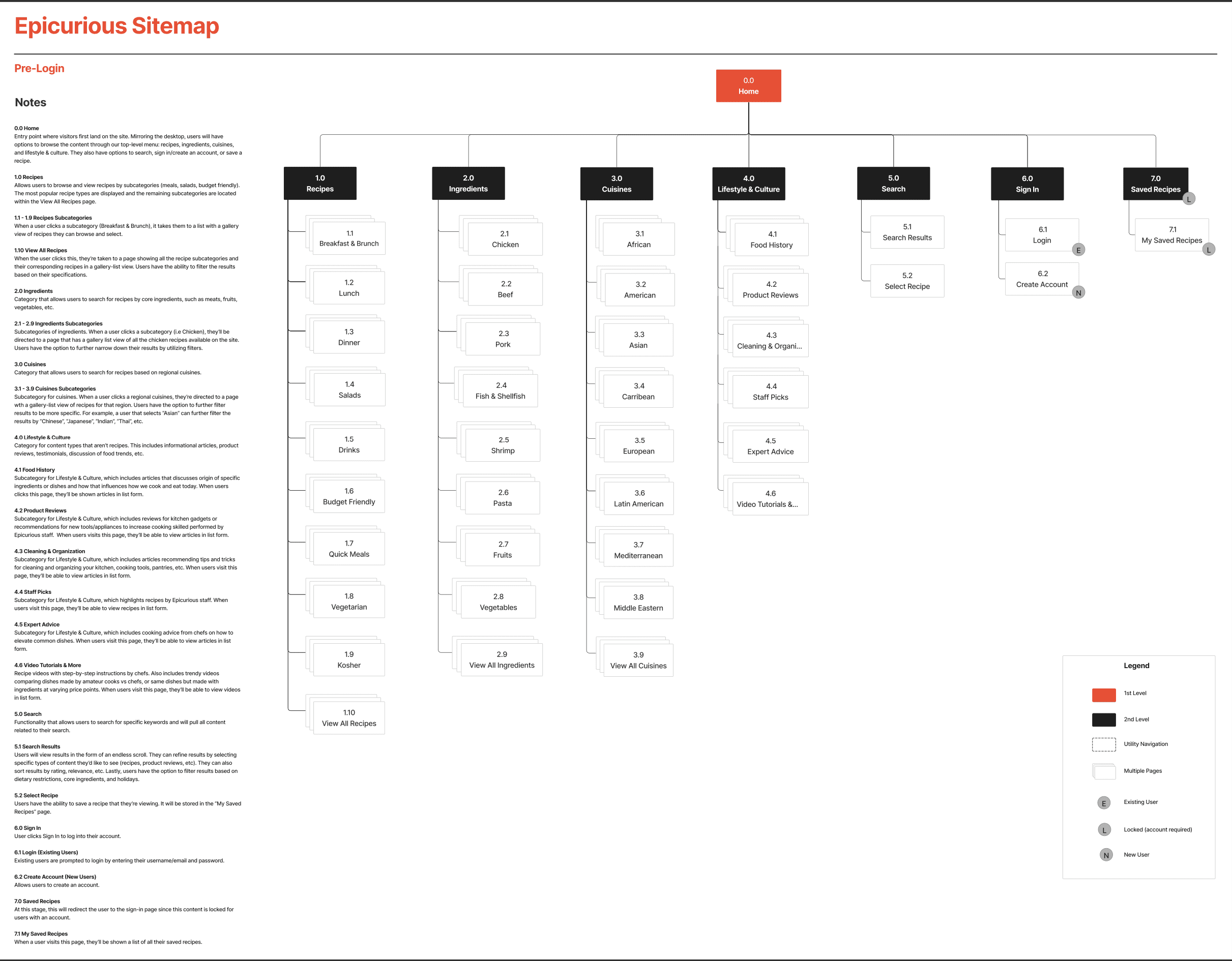
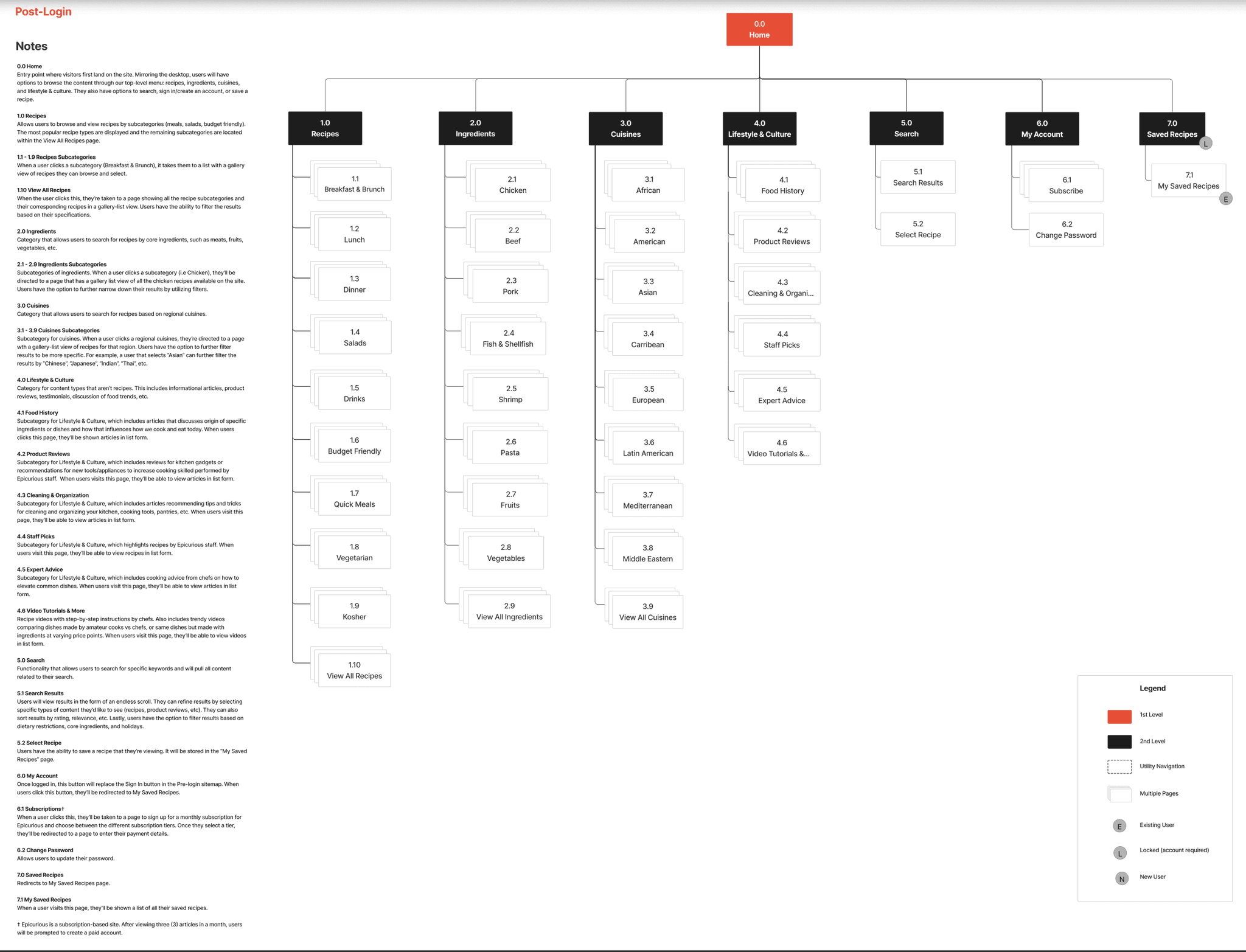
Site Map
After the tree tests, we developed a site map as a first draft of our website content structure.
Research Tasks
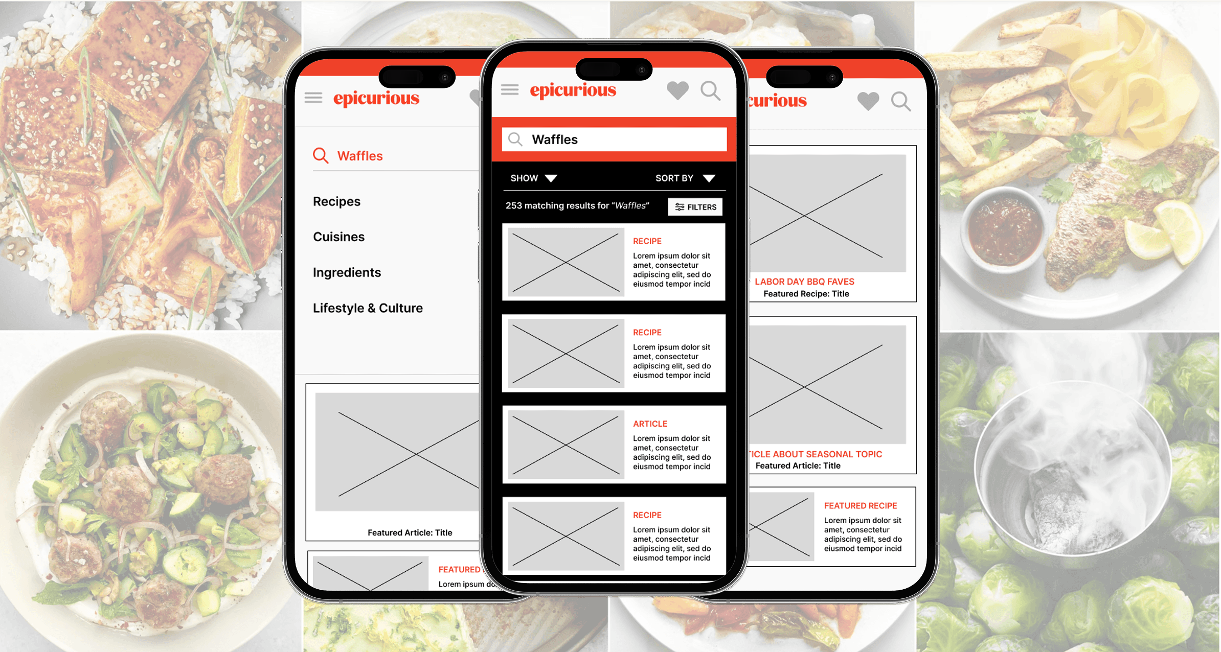
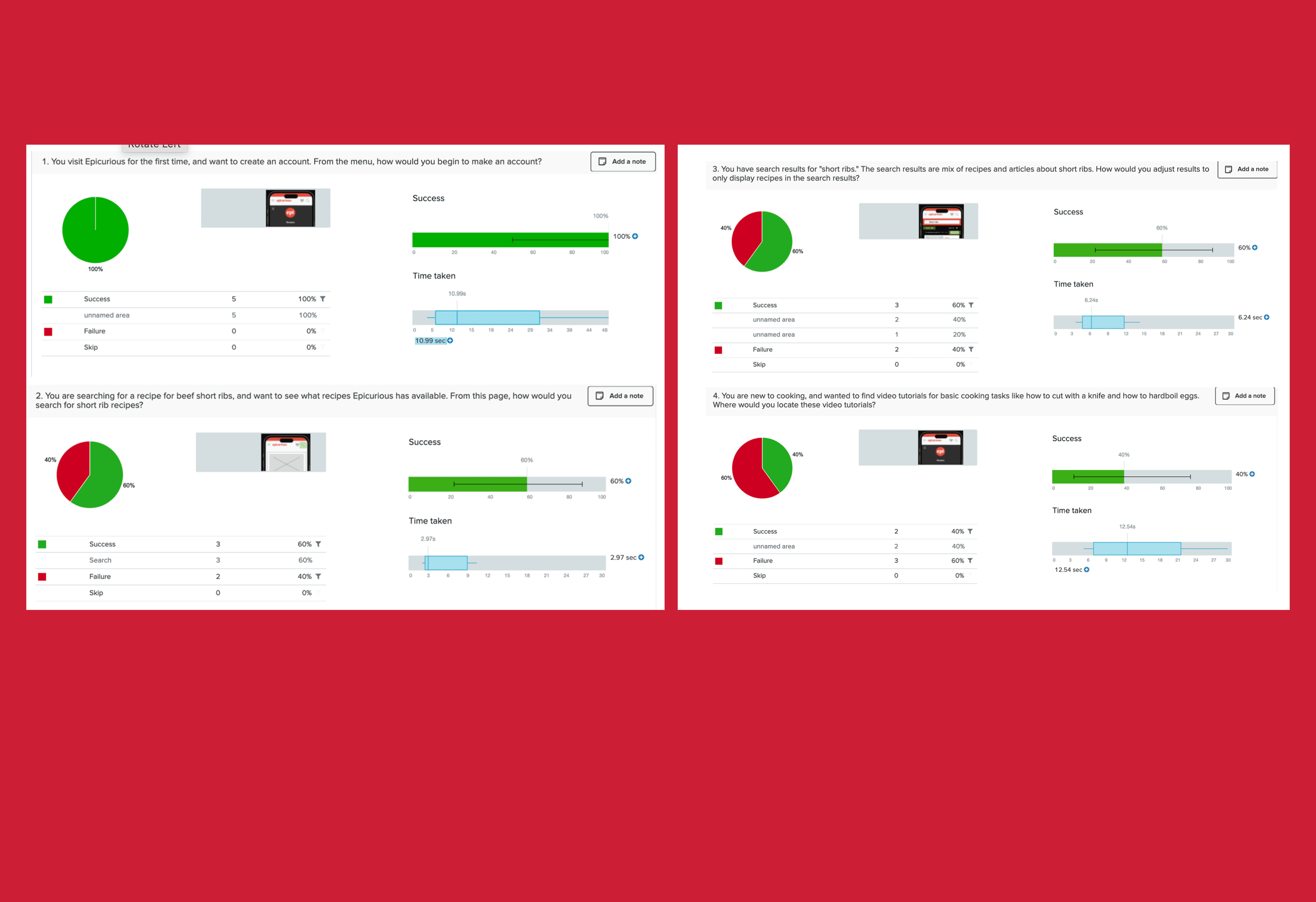
First Click Testing
To evaluate the usability of our proposed information architecture, we conducted first-click testing. Our goal was to see if users could immediately identify where to click to complete core tasks. We tested 4 key tasks across wireframes:
Create an account
Search for a recipe
Filter search results to show only recipes
Find video tutorials
Each task was presented as a prompt with a static wireframe, and we tracked where users clicked first as a proxy for likely task success.
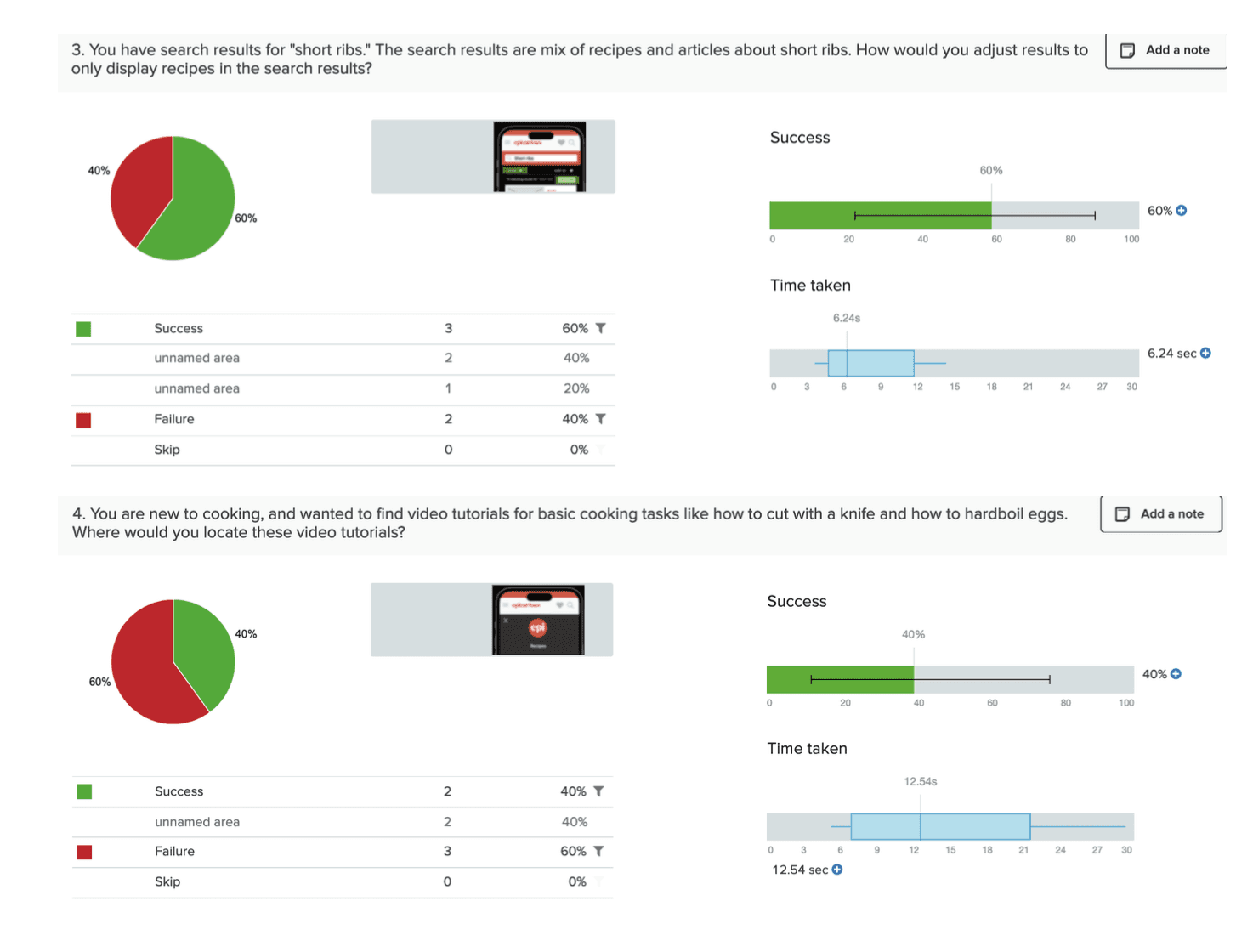
Two example results screens for two treejack tasks
Results
Create an account: 100% success
Filter search results: 60% success
Some users confused the filtering icon with sorting or expected filters to appear earlier in the search flow.Find video tutorials: 40% success
The majority didn’t associate the correct link (“Video Tutorials & More”) with the task.Search for a recipe: 80% success
Most users clicked the search bar immediately, but some browsed over the nav.
IMpact on Design
Account access and the placement of the search bar worked well for users.
However, the recipe filtering feature needed to be more visible and labeled; a tooltip or filter could help with signifying these actions.
The label “Video Tutorials & More” did not perform well as users had trouble identifying it as the correct place for video content. We flagged it for future A/B testing and possible revision.
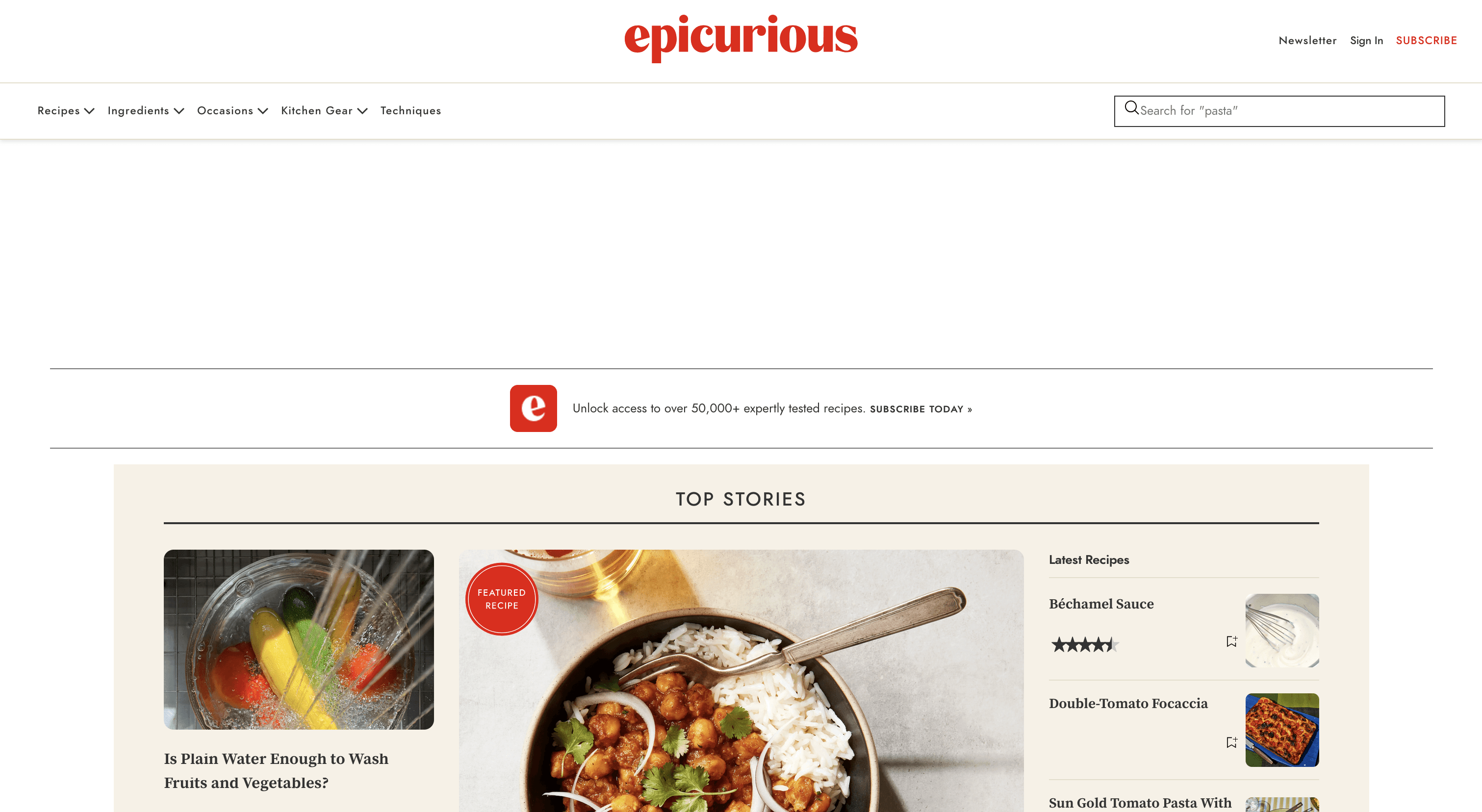
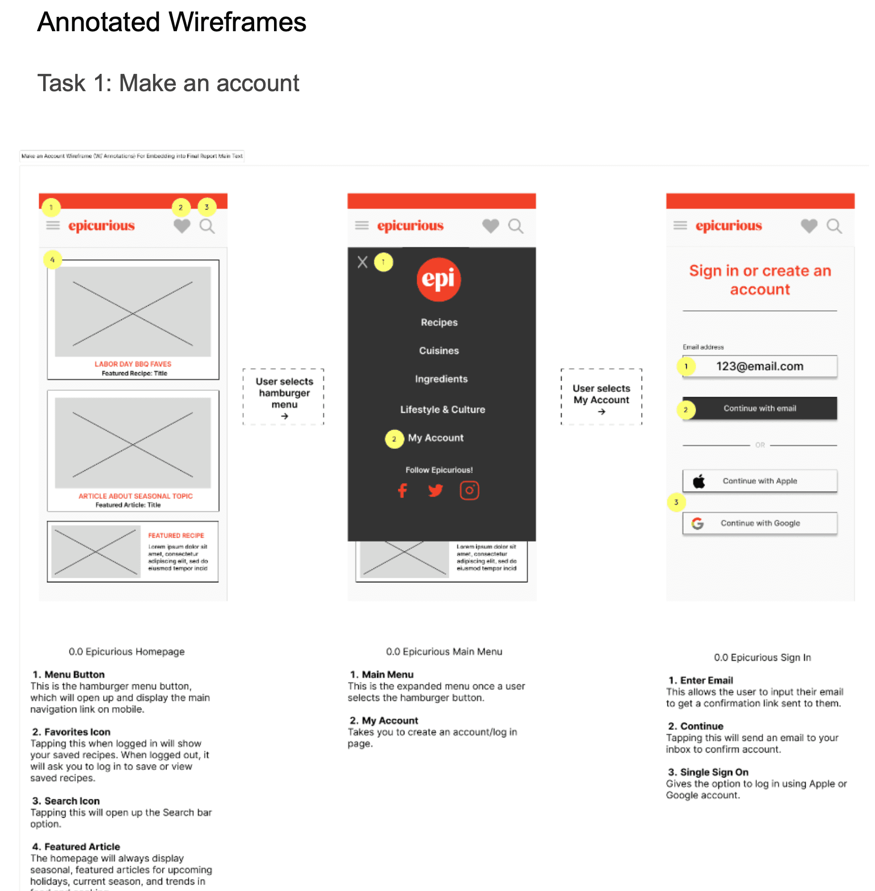
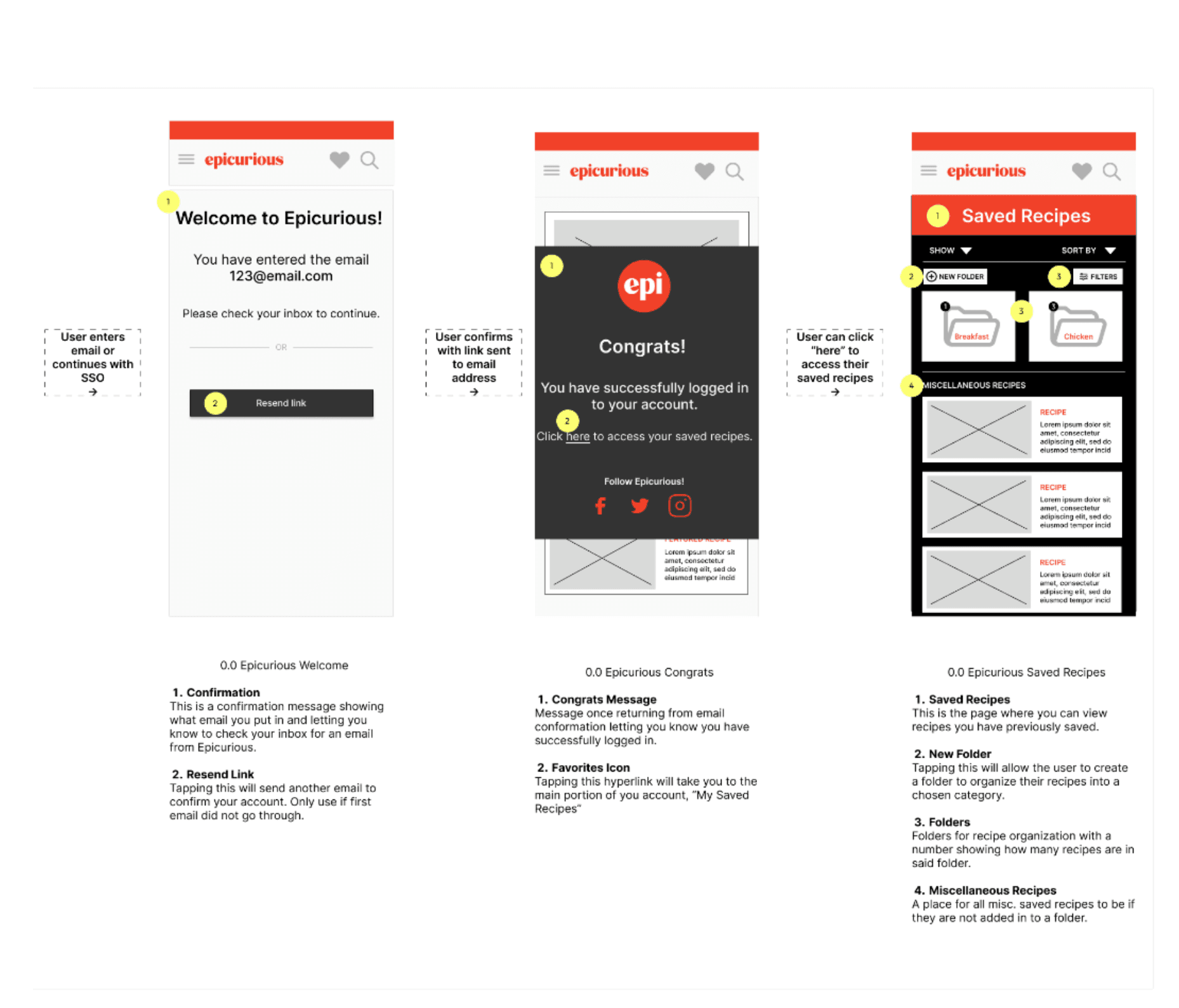
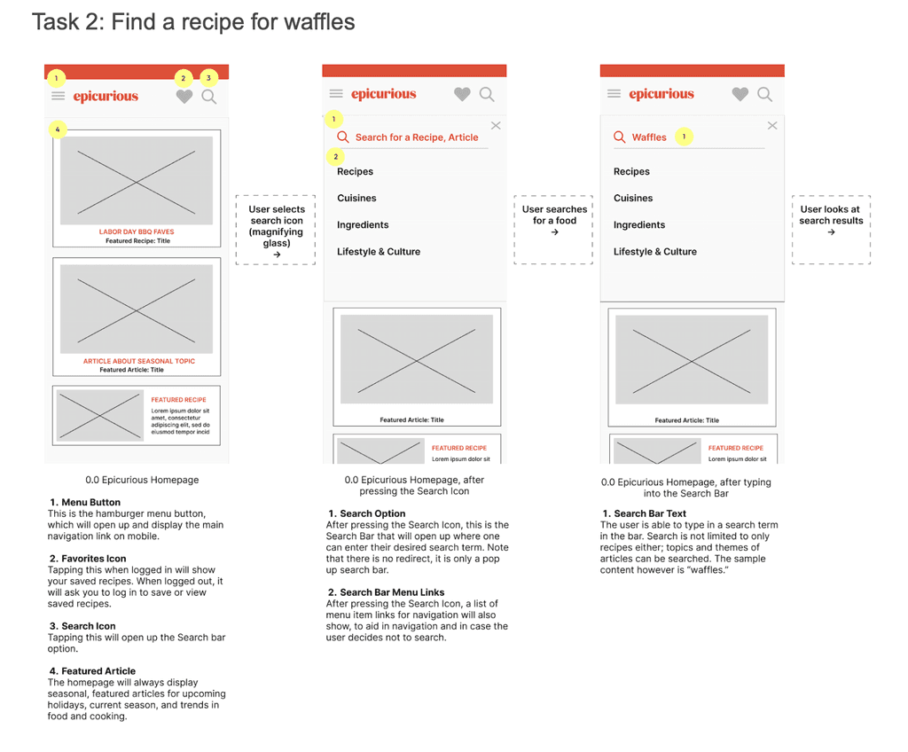
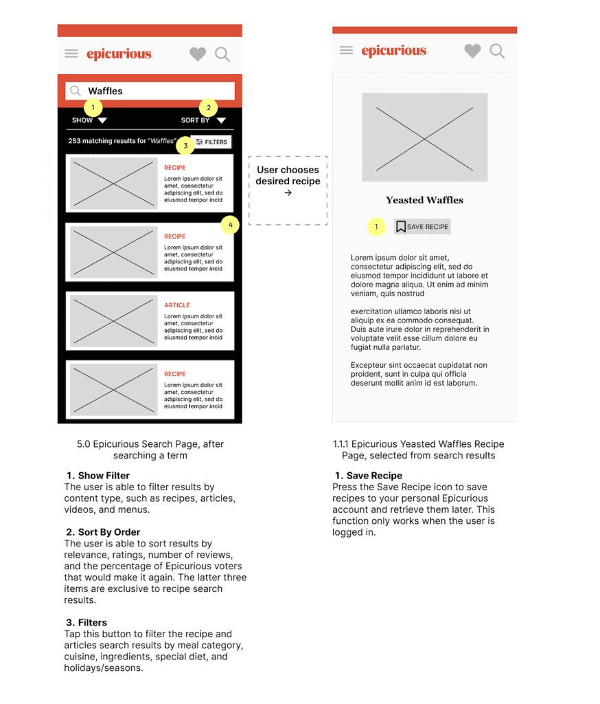
DELIVERABLE
Wireframes
After finalizing the site map, we created wireframes to visualize how key pages and interactions would function with the new structure.
We designed a simplified navigation layout, made the search bar more prominent, and introduced clearer filtering options. For saved content, we explored new ways to organize recipes, such as folders and labels, to better support users planning meals.
If you have an opportunity in mind, or would like to chat, reach out at michellevpham@outlook.com. I'd love to hear from you.