New Diggz: The Concept
New Diggz is a redesign of the existing roommate matching platform Diggz, addressing an issue in the roommate search experience: surface-level compatibility based only on basic preferences. Many users struggle to find roommates who match in terms of lifestyle habits like sleep schedules, cleanliness, and social behaviors.
Our team set out to enhance roommate matching by integrating behavioral data (e.g., sleep habits, social activity).
Project
The existing Diggz roommate matching platform lacked the capability to measure deeper compatibility between users, relying primarily on surface-level preferences. It needed to move beyond basic criteria to incorporate behavioral and lifestyle data, helping users find roommates who truly align with their day-to-day living habits. Furthermore, the current Diggz platform lacked a mobile app and had an outdated design.
Role
I lead the overall research strategy that informed design selections, developing plans and research instruments (e.g., summative test, formative test, the A/B test, and the compatibility score generator). I led UX writing and reporting, and worked closely with everyone on research and synthesis of themes.
Research Methods
Competitive Analysis
Heuristic Evaluation
Survey (n=44)
Mini-Focus Group (n=15)
Formative Usability Testing (n=5)
A/B & First Click Testing (n=32)
Summative Usability Testing (n=21)
Research TaskS
Exploratory Research
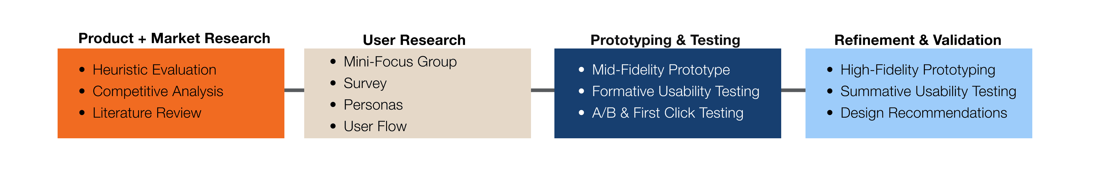
We began by researching the current roommate matching market and evaluating the existing Diggz platform before beginning design work on our mid-fi prototype.
Competitive Analysis
We conducted a competitive analysis of five major roommate matching platforms. We reviewed and logged their key features and assessed their UX/UI.
Heuristic Evaluation of Diggz
We performed a heuristic evaluation of the existing Diggz website. Our team assessed its usability against 13 established heuristics, assigning severity ratings to identified issues. This also allowed us to gain a deep understanding of Diggz’s current site structure and user experience.
Survey
We conducted a survey with 44 participants in the DePaul student pool. The survey gathered data on user preferences when finding a roommate, past experiences with the search, and thoughts on importing biometric and behavioral data into the roommate search.
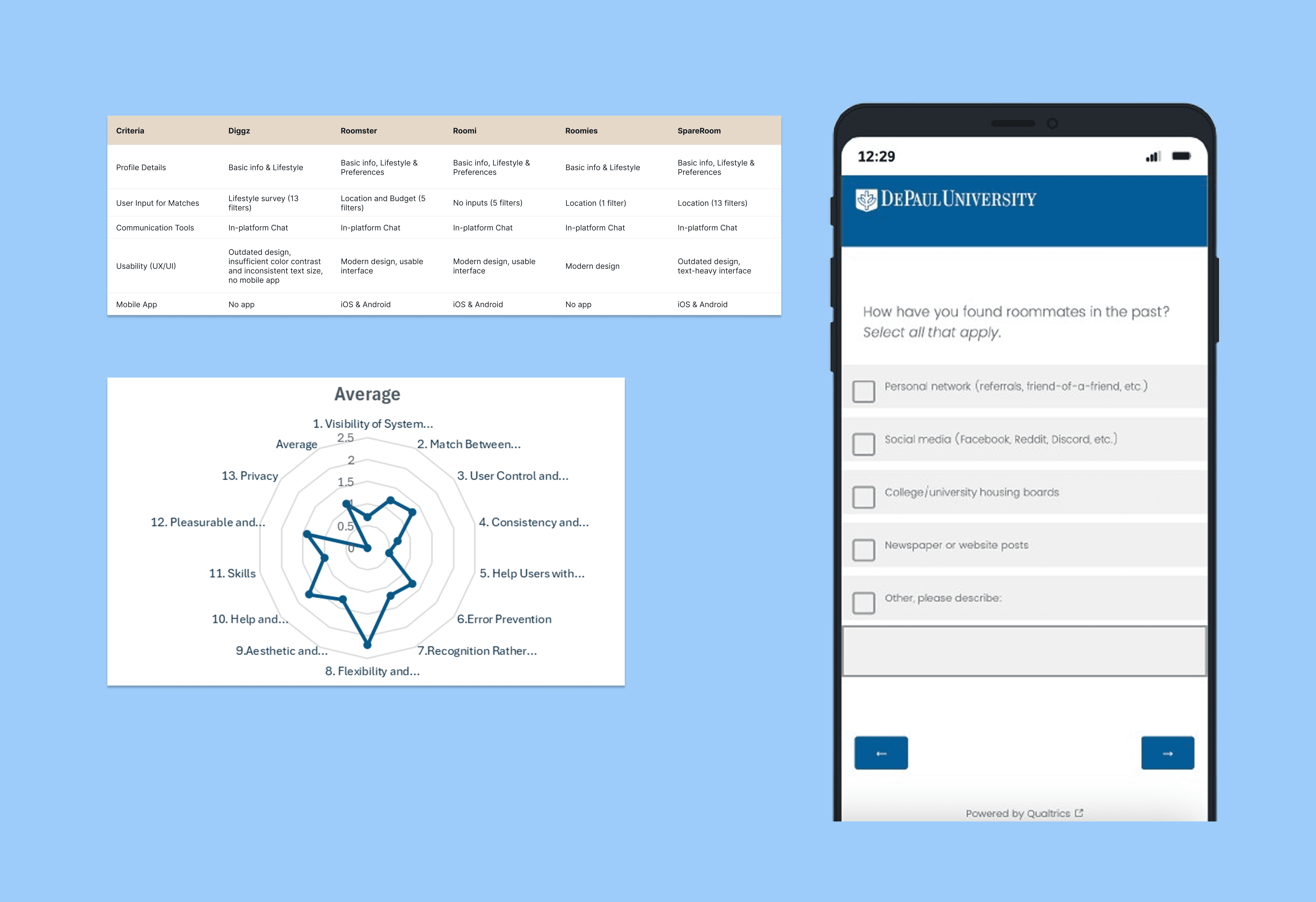
A competitive analysis summary table, a graph of the heuristic evaluation average scores by categories, and a snip of the survey.
Exploratory Research Findings
Roommate finders relied on self reporting
No roommate finders offered the ability to measure/gauge compatibility between users
Diggz had the most in-depth roommate questionnaire, but answers were only displayed as text on profiles rather than being used for algorithmic matching
Diggz lacked a mobile app while most roommate finders offered one
Self report questionnaires have vague categorical answers instead of behaviors
Roommate finders in the market like Diggz failed to capture lifestyle habits. Questionnaires could use vague labels like "clean freak" and "night owl" instead of specific metrics or behaviors
Behaviors was important information to users: when asked about traits that make a bad roommate, 86% (34/44) in the survey cited dirty/messy behavior, with noisiness second at 23%
When asked to list the top three traits desired in a roommate, 77% (34/44) of participants listed cleanliness
Data tracking is a norm, data sharing is new territory
While most participants (68%, n=44) already track biometric data, over half 52% were uncomfortable with the idea of sharing biometric data (e.g. sleep, heart rate)
48% were uncomfortable sharing behavioral data (e.g. phone usage, location), compared to just 34% and 41% who felt comfortable
Only 23% of participants believed access to behavioral data would increase their confidence in roommate decisions
Design implications
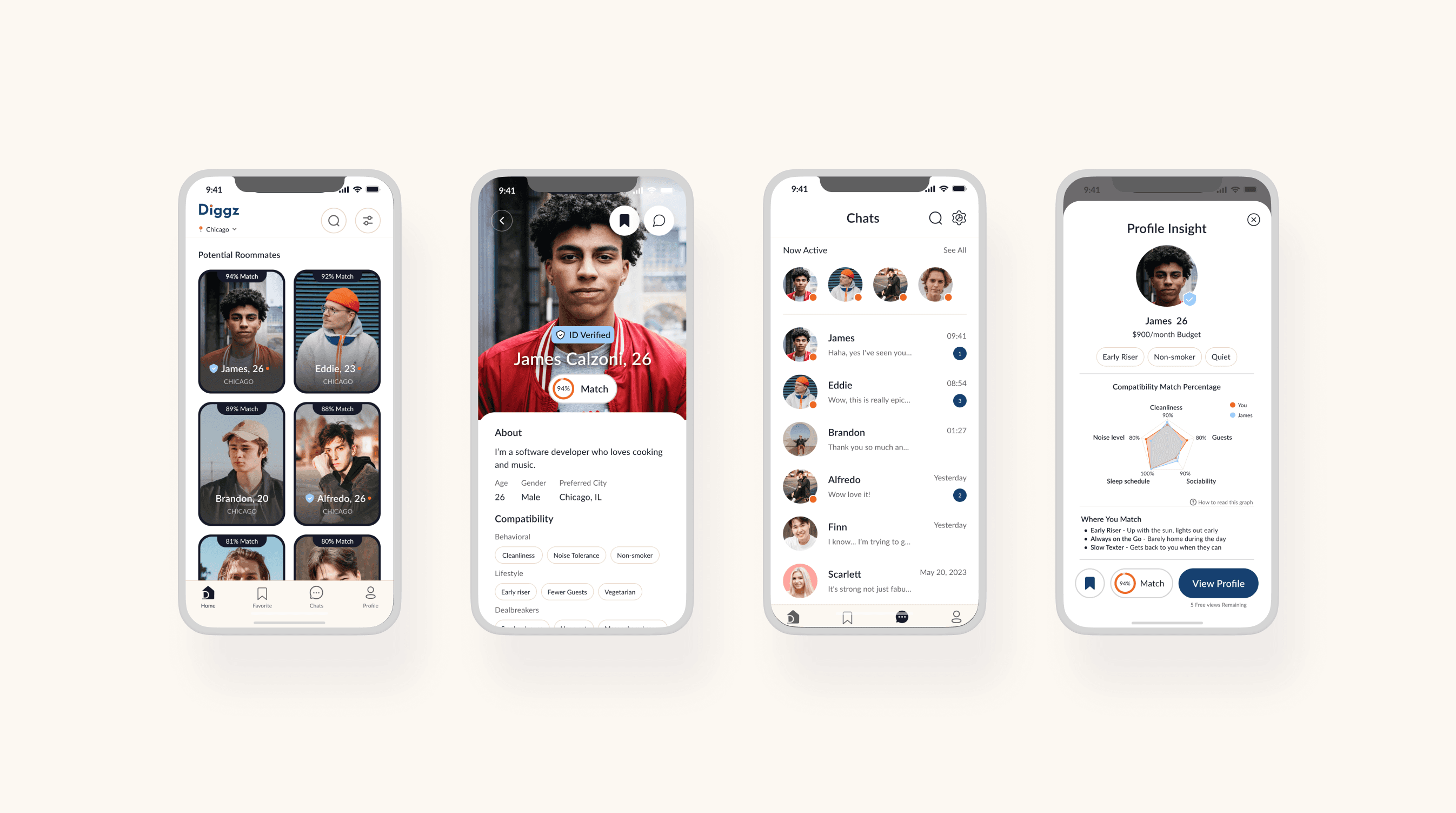
Due to the lack of mobile app, we focused on creating a mobile-first design for Diggz
To make the questionnaire meaningful, we converted it from a static profile display into a compatibility score with a visualization
We redesigned the existing Diggz questionnaire with details and scales
We also began the design of user control features including toggle-based data sharing controls for individual data types and tool tips describing behavioral data categories.
The biggest change might be that we switched our external data import from biometric to behavioral data. This retained the emergent data import concept, while also going with a data type users were more comfortable sharing.
But our work was still cut out for us— it was clear at this point that our concept was unpopular and uncomfortable to potential users, and the value of the product wasn't apparent just yet.
Research TaskS
Evaluative Research
At this point, we were prototyping with a mid-fidelity prototype. Given that we were working with an existing site, we skipped lo-fi and moved into mid-fi. We conducted evaluative research to test and refine this prototype through formative usability testing and A/B testing of visualization methods. We made some interrim changes and created a high-fidelity prototype, which we performed a summative evaluation of.
FORMATIVE USABILITY EVALUATION
After developing our mid-fidelity prototype, we conducted formative usability testing with 5 participants. The testing was designed to identify UX problems with key task flows, and learn how useful the concept was to users. We met to organize observations into an affinity diagram to identify key themes.
A/b TEsting
Following formative feedback that the current compatibility graphic was unclear, we conducted A/B testing with 32 participants. The test compared user interpretations between radar chart and line graph visualizations for displaying roommate compatibility insights. We performed a t-test to analyze results.
SUMMATIVE USABILITY EVALUATION
After incorporating previous insights into our h-fi prototype, we conducted summative usability testing with 26 participants through remote, unmoderated sessions on Useberry, examined completion and error rates, and asked questions about using the product (the same asked in formative testing).
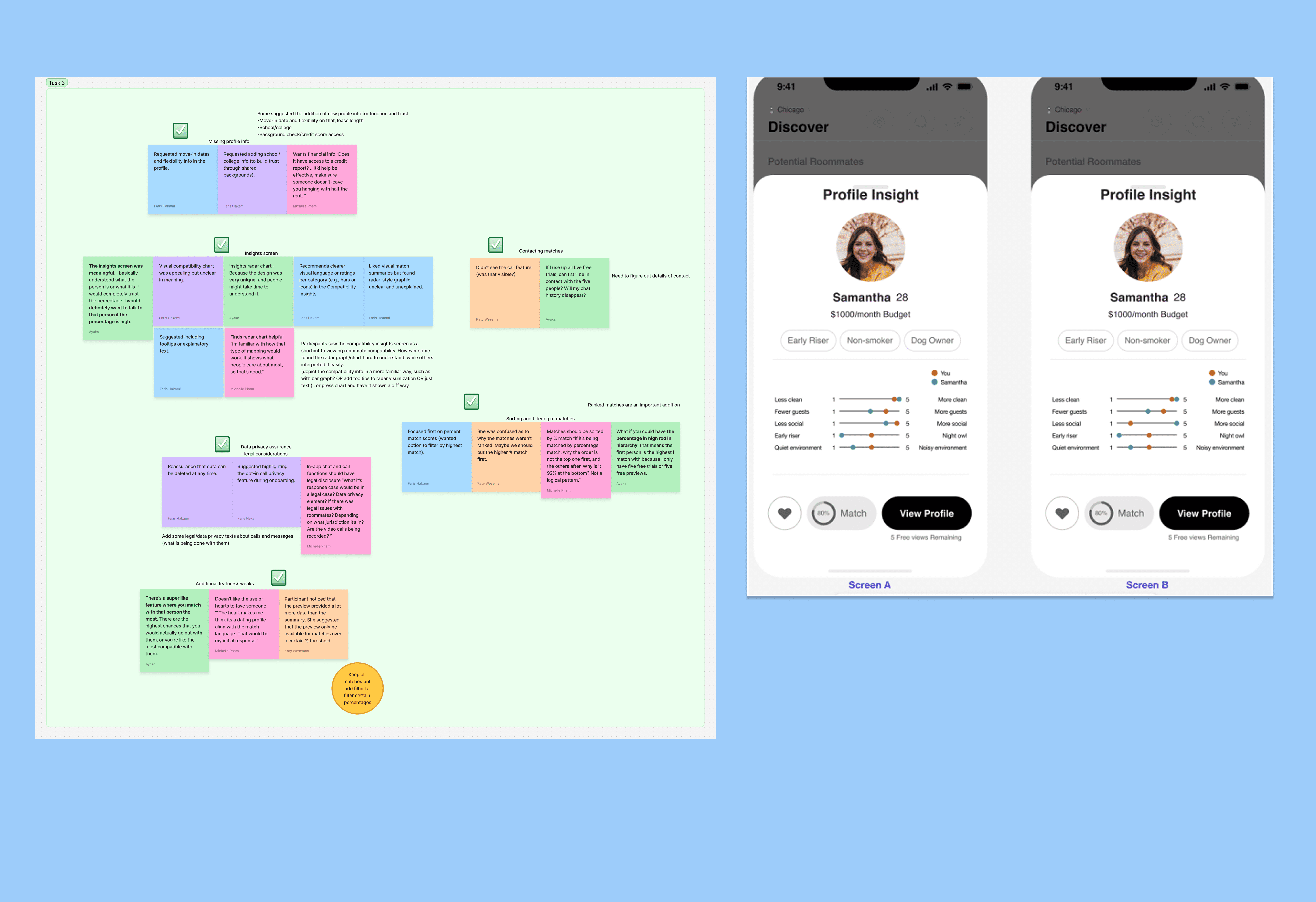
An excerpt of the affinity diagram created for formative test insights and a snip of the A/B test.
More privacy, more user control
In formative testing of the mid-fi prototype, all participants expressed concerns about data privacy across task flows, especially during behavioral data import. These concerns have been a staple within the projecct.
Participants were especially uncomfortable with screen time and location tracking data collection requests, and didn't understand their purpose
Users requested greater control over what they share such as the ability to remove data they had imported.
Participants wanted more information about data usage and who information is shared with.
Design changes: We added comprehensive privacy disclosures stating data is anonymized and encrypted and the ability for users to delete or revoke data access at any time.
Radar charts win the compatibility visualization
In the A/B test radar chart users achieved 75% accuracy on interpretation tasks vs 62.5% for line graph users
Radar chart participants completed tasks more quickly overall with fewer clicks despite slower initial response times
Both visualizations achieved high accuracy rates (87.5% and 93.3% on comparison tasks), and were considered viable
We selected the radar chart for our final prototype due to better user accuracy, while adding enhanced color contrast, visual "pop," tooltips explaining graph interpretation, and supporting text compatibility summaries to help users who struggled with chart interpretation. These changes were made by the final summative usability test.
Usability and user satisfaction
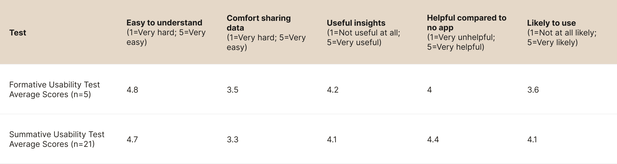
We asked users to complete the same core tasks in the summative evaluation of the hi-fi prototype. The prototype received high completion rates across all tasks (88-96%) with "ease" ratings averaging above 4.0/5 (see the table above)
Task 3 (exploring matches and contacting them) had the lowest ease rating (3.2/5) and highest click count (36.4)
Privacy concerns remained despite design changes, e.g., comfort with data sharing went from 3.5 to 3.3.
User likelihood to use the platform increased from 3.6 to 4.1 between formative and summative testing
The improved ratings between formative and summative testing, especially the increase in perceived helpfulness (4.0 to 4.4) and likelihood to use (3.6 to 4.1) showed that our design changes helped show the platform's value proposition to users. While comfort with data sharing scores remained stable at 3.3-3.5, the improved helpfulness and likelihood to use scores demonstrated that users recognized the platform's utility and were willing to engage with it despite privacy reservations.
Research DELIverable
Mid-Fi to Hi-Fi Prototype Changes

Reflection
Although some part of me believes we should never make a product that makes users uncomfortable, this project was a great window into learning how to make an unpopular concept palateable (plus, I believe these imports will become the norm within the next decade). It was an exercise in balancing the risk/concerns with the value of the product, and tipping the scale toward value while also minimizing risk and emphasizing user control. In practice, there are a lot of avenues in which user comfort might be compromised for a greater good. As this project showed, there could be a way to create a benefit that justifies the risk taken.
If you have an opportunity in mind, or would like to chat, reach out at michellevpham@outlook.com. I'd love to hear from you.